Decoration
17 June 2026
Bathroom Color Ideas: Transforming Your Space for Summer




Our brand
Editorial
Corporate

Product added to Wishlist
Product removed from wishlist
Product added to cart
Product added to cart
CartAdicionado ao comparador
Removido do comparador
To start the search enter at least 3 characters of a description, brand or reference number
17 June 2026
Search here...
Most Popular Articles
Subscribe to the Newsletter
Get the latest news from our brand in your inbox
| Use to bathroom color ideas: transforming your space for summer |
|---|
Bathroom Color Ideas: Transforming Your Space for Summer
|
| Use to view more |
|---|
Curating the Perfect Summer Bathroom Decor
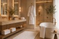
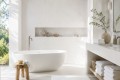
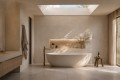
Creating a sophisticated seasonal atmosphere begins with selecting a cohesive and balanced color foundation. Modern summer bathroom decor relies heavily on a clean, intentional interaction between rich textile textures and natural light. This season, luxury design is moving away from clinical, cold all-white spaces and embracing soft, nature-inspired palettes that create a calming, high-end spa aesthetic. When executing a seasonal styling refresh, your chosen colors should reflect the serenity of open landscapes and the effortless luxury of upscale coastal retreats. |
| Use to view more |
|---|
Quick Adjustments for an Instant Bathroom Refresh
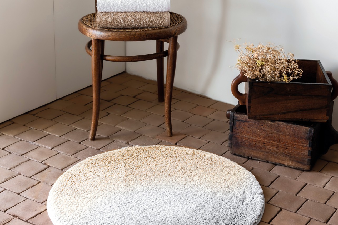
You do not need a complete architectural renovation or expensive structural changes to introduce a premium summer feeling into your private space. A strategic bathroom refresh can be easily achieved through a few deliberate, high-quality textile updates and mindful accessorizing. Investing in premium long-staple cotton towels in your newly selected summer hues instantly changes the visual weight, tactile comfort, and overall ambiance of the room. |
| Use to view more |
|---|
Designing a Timeless Bathroom Color Palette
When choosing your premium seasonal linens, consistency is the ultimate secret to achieving a high-end interior design look. A successful bathroom color palette should always limit itself to three primary tones: a dominant neutral base (60%), a secondary balancing shade (30%), and a singular, sophisticated accent color (10%) presented through your finest accessories. This classic distribution ensures visual harmony and prevents the room from feeling overwhelming or fragmented. |